The concept behind the new visual identity and website of Wattsense
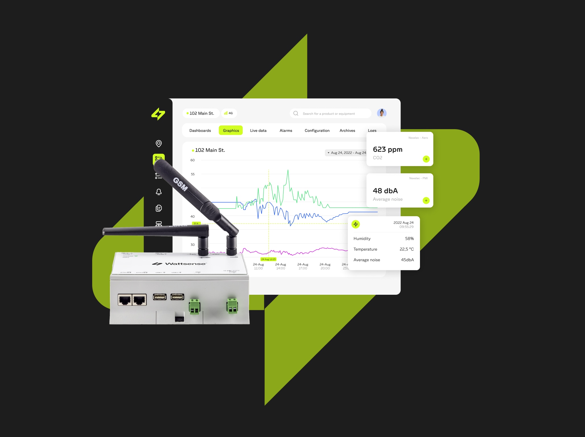
For the last 11 months here at Wattsense, we have been developing our Application Programming Interface (API) for software deployment in Building Management Systems (BMS). Our vision is to lower global energy consumption by providing access for all developers looking to upgrade the code-controlling building equipment.
After a lot of hard work and even more cups of coffee, we started our beta launch this summer, and it's going great. Gearing up for our commercial release in January 2019, the Wattsense team is introducing a new visual identity and website. Check it out!
How our new logo came about
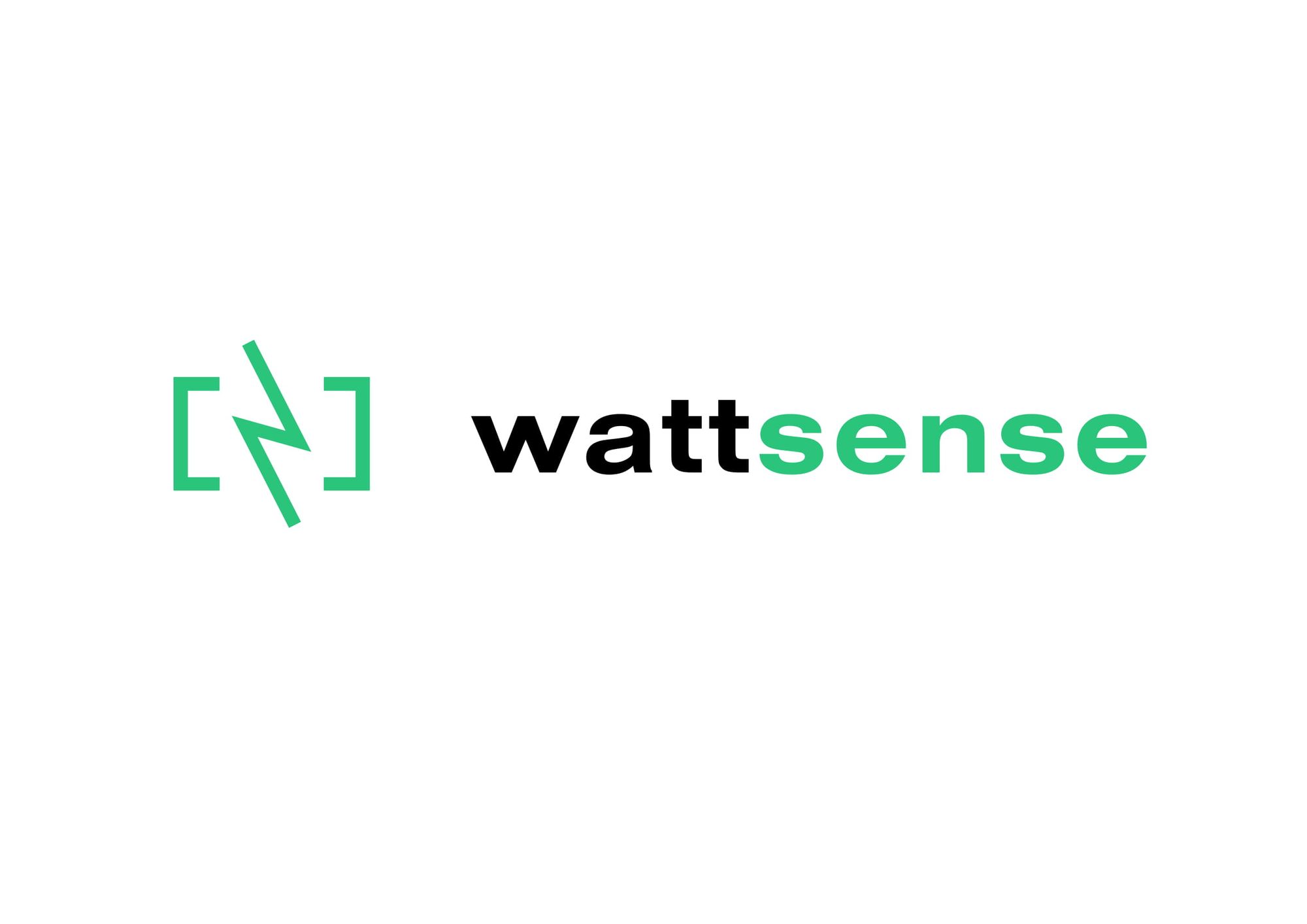
Wattsense, as a name, combines Watt, the unit of power quantifying energy transfer, and the word sense, which refers to understanding and rationality. By linking these two concepts, we are describing our primary purpose, which is to reduce world energy consumption through the API-fication of buildings. Incorporating this concept into our logo was the responsibility of the graphic designer Vincent Gebel, who came up with the symbol of a lightning bolt between brackets as our main logomark. What does it represent? Glad you asked! Take a quick look at the design concept behind the new identity.

The lightning bolt is an apparent reference to the Watt. But even though we enjoy Flash comic books and Greek mythology we are not about threatening power or unruly energy, we are actually the total opposite, that is why the Wattsense lightning is inverted.

BMS controls 9% of the world energy power with a chaotic legacy IT infrastructure that blocks the access for software developers looking to deploy applications easily. Our goal is to change that.

Back to the drawing board, so imagine taking the lightning bolt and “domesticating” it. Now the energy can be controlled and will react to the slightest command through the software created by developers. The hands, softly surrounding the lightning, are the visual metaphor of the sense we aim to bring to the BMS world.
Software developers, our primary users, employ code to upgrade the BMS; that's why brackets, a universal symbol of programming languages, were added to replace the hands. Let’s see how that looks.

Voilà! Now let's add some color. When talking about innovation, energy, and environment, there’s only one way to go: green!

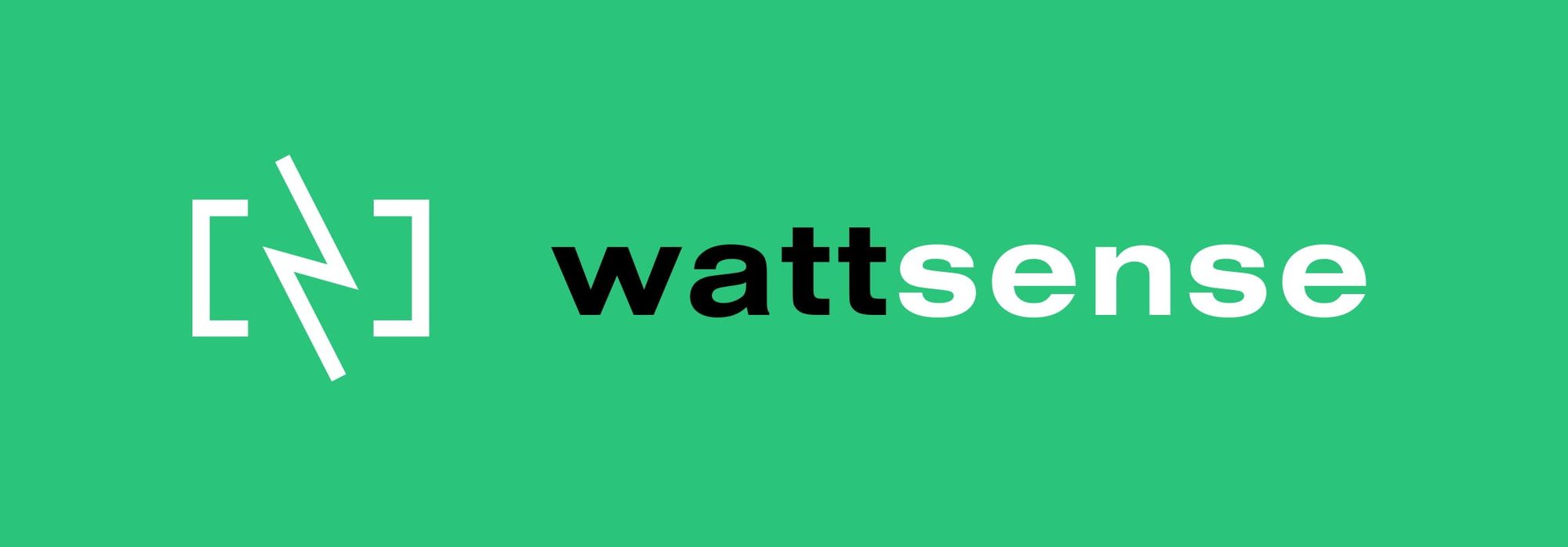
Here is the final result. A logo in its two versions summarizes what we are.
The new look and feel of our website
Now that we have the new logo and visual identity, we needed a website to match. The task at hand was to create a user-friendly site that easily explained how we could help software developers connect their applications to buildings through our API. Our web developer Murilo Boareto Delafrate made it happen.

He created a modern, simple layout that guides the user from the home page to the purchase. The use of illustrations was key to explaining our process.
The following pages compose the site:
Main page: A crash course into what Wattsense is.
BMS: A look into what this equipment is and how you can use Wattsense to improve buildings.
Resources: All the documentation required to break through chaotic IT infrastructure.
Pricing: Everything regarding our prices and the Wattsense advantage.
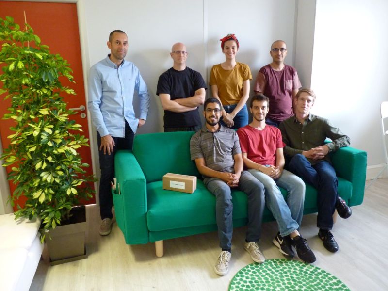
About: Get to know the team and our vision.
Visit our website and discover the new features our platform has to offer if you like what you see and feel our services can be a good fit for your project, contact us. We want to hear from you!
Want to learn more about the Wattsense connectivity solution?
Discover our solution
